When Kadena engaged our team, they aimed to strengthen their visual identity and reach new corporate customers. Their content was fragmented across multiple platforms, making it harder to keep potential customers within their ecosystem.
Our client's outdated brand and website failed to resonate with their community and limited their ability to secure corporate partnerships. Without these relationships, sustaining long-term growth in a competitive market would be difficult.
As sole Product Designer, I led the process of gathering requirements, updating the site map, designing wireframes, and building a scalable design system in Figma that aligned with React. I did this in close collaboration with a cross-functional team.
When
2023
3 Months
Client
Kadena is a blockchain technology company with a platform that enables businesses to build secure applications.
Team
At the core of the design system are modular content blocks that support multiple content types while maintaining brand consistency. This gave authors the flexibility to construct new pages in countless configurations without sacrificing a cohesive look and feel.
The new CMS consolidated blogs and videos that had been scattered across separate platforms into one central hub. This made it easier for the team to create new content and kept visitors engaged longer.
A video demonstrating the design system in Figma. The CMS admin view works in a similar way, allowing authors to construct pages in any configuration while maintaining design consistency.
Shown below are the key activities that occurred each month to meet our deadline.
October 2023
November 2023
December 2023
January 2024
After an initial research phase to understand our client's goals, we analyzed their current content, identified gaps, and built an updated site map. This acted as the blueprint for building wireframes and the design system.
Our third iteration of the site map that reflected the brand's content ecosystem and future-facing goals.
Once the brand guidelines were approved by our client, we built a limited palette that would support our dark mode design direction. The blue range of colors would be applied to surfaces. Base colors would be applied to fonts and iconography. The brand hue and accent colors would be used for interactive elements and decorative delight.
Once the brand guidelines were approved, we built a focused dark mode color palette.
The visual designer selected two typefaces, one for headlines and one for body copy. With this direction, I built a typography system that covered a variety of content use cases. Headlines were designed to scale from a larger size on desktop to a smaller size on mobile.

On the left, the full typography system with headlines and body copy sizes. On the right, the mobile sizes for headlines. Building a responsive system ensured designs would look good across viewports.
Using the site map and content strategy as a guide, I sketched low-fidelity wireframes and initial design system components. We used these for internal discussions and to secure buy-in from our client.

An early version of the Community page, shown here in sections, built with the first iteration of components.
To meet our tight timeline, the development team began implementing this non-styled version of the design system.
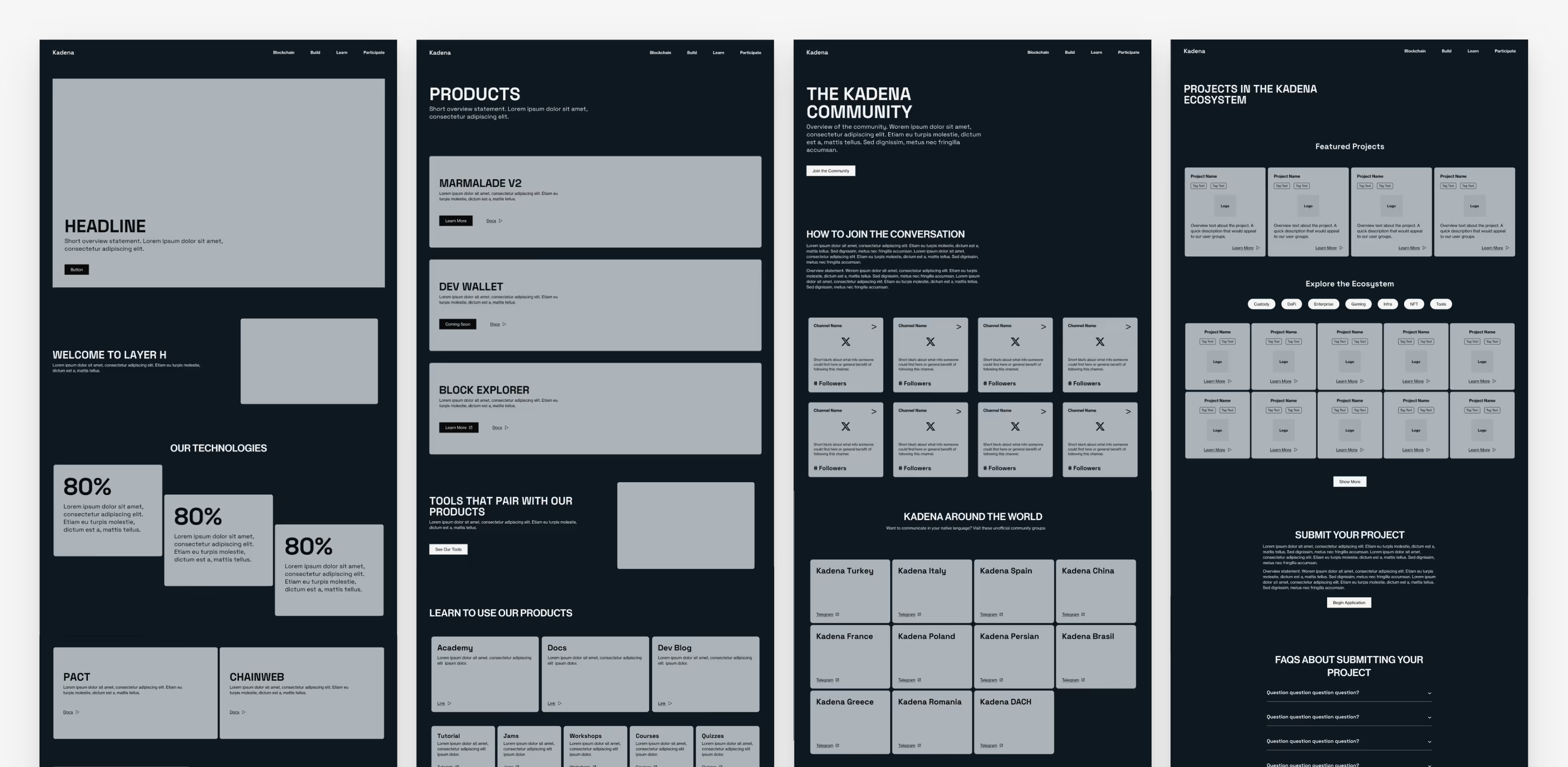
The desktop wireframes of the Home, Product, Community, and Projects pages built with design system components. The development team began building this non-styled version of the system to keep pace with our tight timeline.
I worked closely with the Visual Designer to apply his design direction to the Figma components. I then communicated design updates to our development team by writing detailed tickets for our Kanban board. Many of the changes were CSS updates, while others, such as the carousel, were functional updates. Because our development had a head start, they had room to implement functional changes and still meet our timeline.
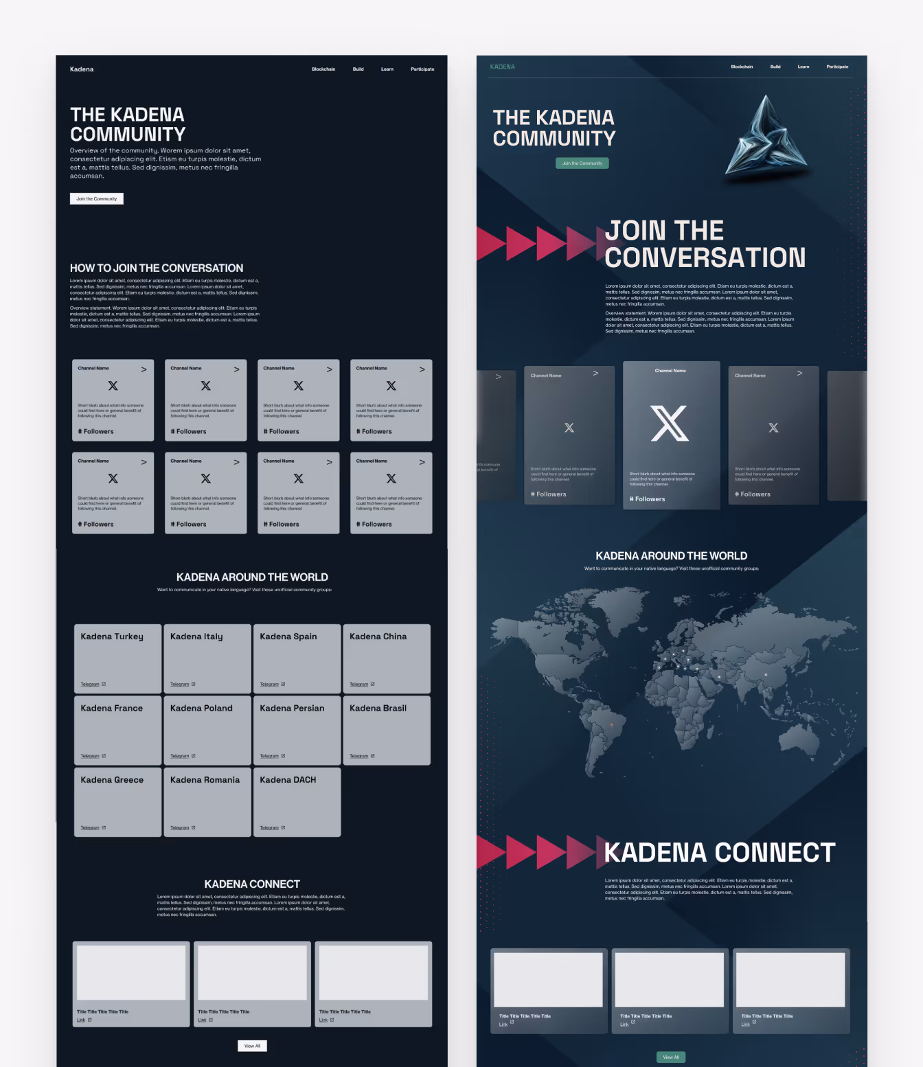
A before and after of the Community page. On the left, the page is built with components without styling, on the right, components are updated with the visual designer's design direction.
Collaboration and agility within the team were key to meeting the aggressive three‑month deadline. Much of the work happened in parallel: the Visual Designer was still refining brand guidelines while the development team was building the site. This project demonstrated that it’s possible to deliver on core needs without waiting for every step to be finalized or perfected.
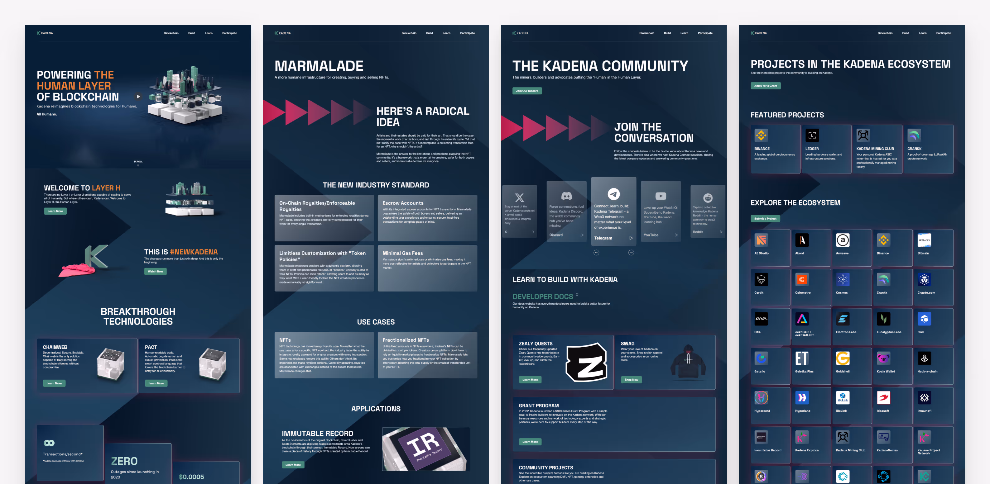
Screenshots of the Homepage, Product Detail, Community, and Projects pages on the day of launch, January 3, 2024.
After I left the project, the client refined its brand identity and the system supported that evolution. When their brand shifted from a dark to light palette, the development team adjusted the core variables, making this update was quick and efficient.
Without a dedicated design system designer, larger changes have strained the development team and resulted in a disjointed codebase. Had I continued on this project, I would have gathered client feedback, monitored component usage, and made updates that prioritized consistency in design and code.